Here are some examples of styles for reference. Try inspecting the page and adding t-gold, t-conversions or t-network-services to the body class (you might need to reload the page to try these out). This, by the way is basic, normal copy styling. This is bold. This is italic. This is a link.
This is a h1 default class
This is a h1, class=”c1f”
This is a h1, class=”c1b”
This is a h1, class=”c2f”
This is a h1, class=”c2b”
This is a h1, class=”c1″
This is a h1, class=”c2″
This is a h2 default class
This is a h2, class=”c1f”
This is a h2, class=”c1b”
This is a h2, class=”c2f”
This is a h2, class=”c2b”
This is a h2, class=”c1″
This is a h2, class=”c2″
This is an h2 class=”fancy”
… and on down
Buttons – though some of these styles can be used for other stuff
This is an a class=”button” Called a CTA or Call To Action button. Use these for most action links. buttons can also be combined with directional classes as follows.
“button up” “button left” “button down”
“button for .pdf” button for .ppt” button for .doc” button for external link
This is an a class=”button wide”
This is an a class=”button big”
This is an a class=”button big wide”
This is an a class=”button lightgreen”
This is an a class=”button bottom” it sticks to the bottom of the content
This is an alternate category colored class=”button2″ for inside blockquotes
This is a link to a PDF it gets the icon automatically.
This is a link to a PPT
This is a link to a DOC
This is an external link
This is an external link
Use class=”noicon” to turn the icon off (like this one)
This is an h1 inside a blockquote
This is a blockquote, or a pull quote. use for highlighting a sentence or 2 from the content. This is the normal content information.
This is an h2 in a blockquote
More paragraph copy. This is a link in the quote.
This is an h3 in a blockquote
and even more paragraph content.
Alerts
this header, just so you know, is style=”clear:both” to get us out from beside that blockquote.
This is a p class=”alert”
This is a p class=”alert-help” or “success”
This is a p class=”alert-info” or “notice”
This is a p class=”alert-error” or “error”
Definition Lists
- This is the definition term
- this is the definition description. this is the definition description. this is the definition description. this is the definition description.
- This is the definition term
- this is the definition description. this is the definition description. this is the definition description. this is the definition description.
- This is the definition term
- this is the definition description. this is the definition description. this is the definition description. this is the definition description.
- This is the definition term
- this is the definition description. this is the definition description. this is the definition description. this is the definition description.
Some Utility Styles
This is a span class=”emph” Used for stuff like NEW!
This is a span class=”fineprint”
This is a span class=”credit” (not sure where this is used)
.nomargin is just that, no margin
.nomargin is zero margin, .nogutter is negative margin to compensate for @gutter px
.nogutter is useful when make a Sidebar CPT of links, and using a ul class=”fancy”, make it a ul class=”fancy nogutter” and it’ll look right.
.floatright, .floatleft
Cards Element
GitLab issue 88 is going to rename leadership-block to cards
looks like this – inspect the code to reuse HTML
div class=”fourcols cards”
Pros:
You are guaranteed not to miss out on features because you have the wrong version of code.
We provide instructions on how to load the releases, as well as release training and release notes.
- We certify the release for functionality.
- Releases are low impact to your operations.
Cons:
- You must comply with certain requirements (outlined in the companion guide already mentioned), including loading releases by specified deadlines.
- There is a modest cost.
- You are involved in actually loading the releases.
Pros:
You are guaranteed not to miss out on features because you have the wrong version of code. We provide instructions on how to load the releases, as well as release training and release notes.
- We certify the release for functionality.
- Releases are low impact to your operations.
Cons:
- You must comply with certain requirements (outlined in the companion guide already mentioned), including loading releases by specified deadlines.
- There is a modest cost.
- You are involved in actually loading the releases.
div class=”threecols cards”
Pros:
You are guaranteed not to miss out on features because you have the wrong version of code.
We provide instructions on how to load the releases, as well as release training and release notes.
- We certify the release for functionality.
- Releases are low impact to your operations.
Cons:
- You must comply with certain requirements (outlined in the companion guide already mentioned), including loading releases by specified deadlines.
- There is a modest cost.
- You are involved in actually loading the releases.
Other:
- You must comply with certain requirements (outlined in the companion guide already mentioned), including loading releases by specified deadlines.
- There is a modest cost.
- You are involved in actually loading the releases.
div class=”twocols cards”
Pros:
You are guaranteed not to miss out on features because you have the wrong version of code.
We provide instructions on how to load the releases, as well as release training and release notes.
- We certify the release for functionality.
- Releases are low impact to your operations.
Cons:
- You must comply with certain requirements (outlined in the companion guide already mentioned), including loading releases by specified deadlines.
- There is a modest cost.
- You are involved in actually loading the releases.
This is a Table
this is a table class=”sortable” (tabledata, if you see it still is a holdover from the old cuanswers). It automatically zebra stripes for you.
| This is a thead th | This is a link in a th | This is a td in the thead | City | State |
|---|---|---|---|---|
| This is a link in a td | This is a td in the tbody | This is a th in the tbody | Illinois | |
| This is a link in a td in the tbody | This is a td in the tbody | This is a td in the tbody | Illinois | |
| This is a link in a td | This is a td in the tbody | This is a td in the tbody | Illinois | |
| This is a link in a td of the tfoot | This is a td in the tfoot | This is a th in the tfoot | Illinois |
un-ordered lists with the “fancy” class
ul.fancy.compact
ol.fancy
- Thing One
- Thing Two
- Thing Three
- You get the point?
- This is an a inside a fancy ol
ul.attachments containing a[type=pdf] or other icons
ul.attachments.compact containing a[type=pdf] or other icons
ul.fancy.less-compact
this puts the rel icon on the left side in place of the list bullet. works without .less-compact, or with .compact
- 2014 Leadership Conference – Presentation (PPT)
- 2014 Leadership Conference – Presentation (PDF)
- 2014 Annual Stockholders Meeting – Presentation (PPT)
- 2014 Annual Stockholders Meeting – Presentation (PDF)
ul.fancy.less-compact.nobg
a more subtle background on the ul li
- 2014 Leadership Conference – Presentation (PPT)
- 2014 Leadership Conference – Presentation (PDF)
- 2014 Annual Stockholders Meeting – Presentation (PPT)
- 2014 Annual Stockholders Meeting – Presentation (PDF)
A Form
A Guided Tour of CU*Answers - More Info
More info page of guide tour
This is a template and reference for creating a p img that works at all responsive sizes
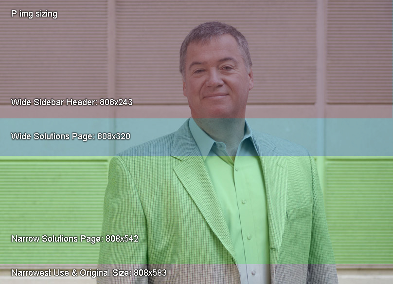
Download this psd template for double checking your p img works at all responsive sizes
This is a template and reference for creating a feature banner that works at all responsive sizes
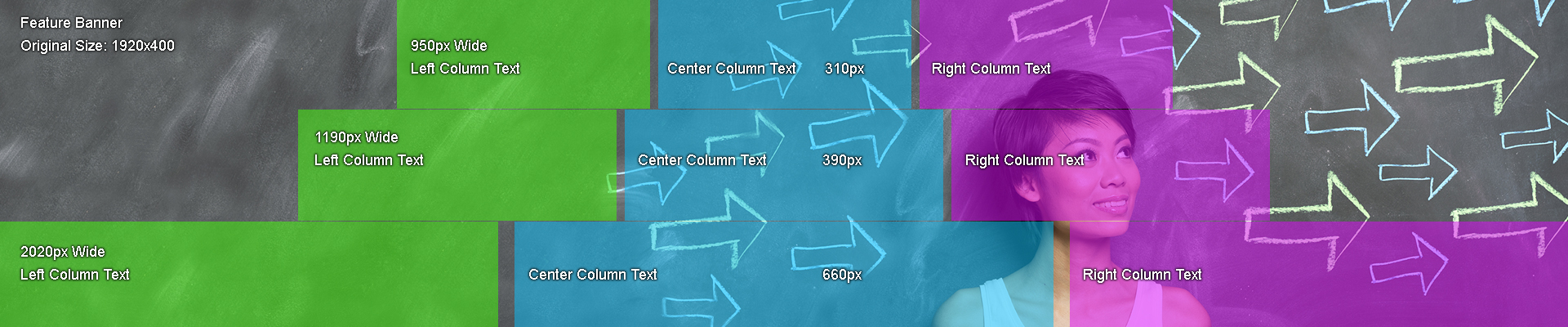
Download this psd template for double checking your feature banner works at all responsive sizes
Accordion Content
Click the following headings to see the content expand and contract.
Driving Loan Volume
- I want more loans
- I want merchant partners
- I want members to spend / Manage the return of your loan portfolio
- I want more loans: via refinance
- I want to understand my loan performance risk
- I want to increase mortgage loan balances
- Get members to use their available LOC loans
- I want more mortgages
- When to remove PMI
- What to do with abandoned applications?
- Don’t lose out on mortgages!
Income Impact
- I want members to use their credit and debit cards
- I want greater eStatement penetration
- Who is waiving member fees on staff
- Follow up on member loan payoffs
- How do I improve my collections process
- Gathering 5300 Collection numbers
- Classifications made easy
Managing Credit Risk
- I want to monitor my dealer loan portfolio
- I want to work with members with credit scores are improving or dropping
- Are my loans priced right?
- I want my credit cards to be used
Cross Sell Opportunity
- I want to increase my number of services per member
- I want more checking accounts
- I want more loans with existing members
- I want more debit cards
- I want to increase my deposits


